| Function | Description |
|---|---|
| tm_scale_categorical() | Categorical scale |
| tm_scale_ordinal() | Ordinal scale |
| tm_scale_intervals() | Intervals scale |
| tm_scale_discrete() | Discrete scale |
| tm_scale_continuous() | Continuous scale |
| tm_scale_rank() | Rank scale |
| tm_scale_continuous_log(), tm_scale_continuous_log2(), tm_scale_continuous_log10(), tm_scale_continuous_log1p(), tm_scale_continuous_sqrt(), tm_scale_continuous_pseudo_log() | Logarithmic scales |
| tm_scale_rgb() | RGB scale |
| tm_scale_bivariate() | Bivariate scale |
| tm_scale_asis() | As-is scale |
8 Scales
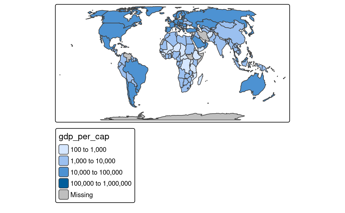
Sections Section 7.3, Section 7.4, and Section 7.5 showed how to set colors, sizes, and shapes for different types of spatial objects. In them, we often used the tm_scale() function to modify the appearance of the map, such as changing the color palette (col.scale and fill.scale), sizes (size.scale), or shapes (shape.scale). The tm_scale() function automatically sets the scale for the given visual variable and the data type (factor, numeric, and integer). Thus, for example, when we provide a character variable’s name to the fill argument, then the tm_scale() function automatically sets the color scale for a categorical variable, and when we provide a numeric variable’s name to the size argument, then the tm_scale() function automatically sets the size scale for a continuous variable.
However, we often want to have more control over how our spatial objects are presented on the map. For that purpose, the tm_scale() function has a set of related functions that can be used to modify and customize the used scale. Table Table 8.1 presents all available scale functions in tmap. Let’s see how to use them in the following sections – we will mostly focus on using scales for the fill.scale argument, but the same principles apply to the col.scale, size.scale, and shape.scale arguments.
8.1 Categorical scales
An example of a categorical map can be seen in Figure 8.1. We created it by providing a character variable’s name, "region_group", in the fill argument.
tm_shape(slo_regions) +
  tm_polygons(fill = "region_group")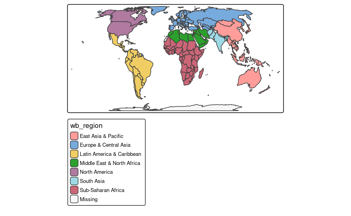
The tm_polygons(fill = "region_un", fill.scale = tm_scale_categorical()) code is run automatically in the background in this case. It is possible to change the names of legend labels with the labels argument of the tm_scale() function. As mentioned in the Section 7.3 we can also change the used color palette with the values argument.
8.2 Intervals scales
Intervals scales are used to represent continuous numerical variables using set of class intervals. In other words, values are divided into several groups based on their properties. Several approaches can be used to convert continuous variables to intervals, and each of them could result in different groups of values. Most of them use the classInt package (Bivand 2020) in the background, therefore some additional information can be found in the ?classIntervals function’s documentation.
By default, the tm_scale_intervals() function is used in the background (Figure 8.2 (a)). It uses a style called “pretty”, which creates breaks that are whole numbers and spaces them evenly 1.
tm_shape(slo_regions) +
  tm_polygons(fill = "pop_dens")
It is also possible to indicate the desired number of classes using the n argument of the tm_scale() function provided to the fill.scale argument. While not every n is possible depending on the input values, tmap will try to create a number of classes as close to possible to the preferred one.
The next approach is to manually select the limits of each break with the breaks argument of tm_scale() (Figure 8.2 (b)). This can be useful when we have some pre-defined breaks, or when we want to compare values between several maps. It expects threshold values for each break, therefore, if we want to have three breaks, we need to provide four thresholds. Additionally, we can add a label to each break with the labels argument.
Another approach is to create breaks automatically using one of many existing classification methods with the style argument of the tm_scale() function. Three basic methods are "equal", "sd", and "quantile" styles. Let’s consider a variable with 100 observations ranging from 0 to 10. The "equal" style divides the range of values into n equal-sized intervals. This style works well when the values change fairly continuously and do not contain any outliers. In tmap, we can specify the number of classes with the n argument or the number of classes will be computed automatically . For example, when we set n to 4, then our breaks will represent four classes ranging from 0 to 2.5, 2.5 to 5, 5 to 7.5, and 7.5 to 10. The "sd" style represents how much values of a given variable varies from its mean, with each interval having a constant width of the standard deviation. This style is used when it is vital to show how values relate to the mean. The "quantile" style creates several classes with exactly the same number of objects (e.g., spatial features), but having intervals of various lengths. This method has an advantage or not having any empty classes or classes with too few or too many values. However, the resulting intervals from the "quantile" style can often be misleading, with very different values located in the same class.
To create classes that, on the one hand, contain similar values, and on the other hand, are different from the other classes, we can use some optimization method. The most common optimization method used in cartography is the Jenks optimization method implemented at the "jenks" style (Figure 8.2 (c)).
tm_shape(slo_regions) +
  tm_polygons(fill = "pop_dens",
              fill.scale = tm_scale_intervals(style = "jenks"))
The Fisher method (style = "fisher") has a similar role, which creates groups with maximized homogeneity (Fisher 1958). A different approach is used by the dpih style, which uses kernel density estimations to select the width of the intervals (Wand 1997). You can visit ?KernSmooth::dpih for more details.
Another group of classification methods uses existing clustering methods. It includes k-means clustering ("kmeans"), bagged clustering ("bclust"), and hierarchical clustering ("hclust").
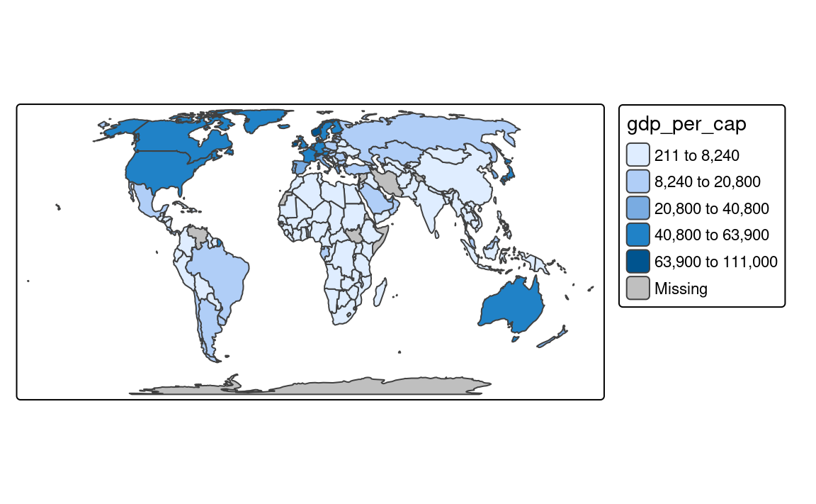
Finally, there are a few methods created to work well for a variable with a heavy-tailed distribution, including "headtails" and "log10_pretty". The "headtails" style is an implementation of the head/tail breaks method aimed at heavily right-skewed data. In it, values of the given variable are being divided around the mean into two parts, and the process continues iteratively for the values above the mean (the head) until the head part values are no longer heavy-tailed distributed (Jiang 2013). The "log10_pretty" style uses a logarithmic base-10 transformation (Figure 8.2 (d)). In this style, each class starts with a value ten times larger than the beginning of the previous class. In other words, each following class shows us the next order of magnitude. This style allows for a better distinction between low, medium, and high values. However, maps with logarithmically transformed variables are usually less intuitive for the readers and require more attention from them.
tm_shape(slo_regions) +
  tm_polygons(fill = "pop_dens",
              fill.scale = tm_scale_intervals(style = "log10_pretty"))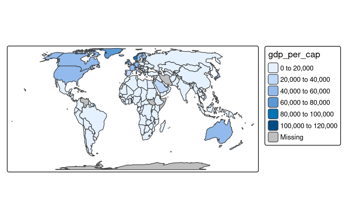
8.3 Discrete scales
8.4 Continuous scales
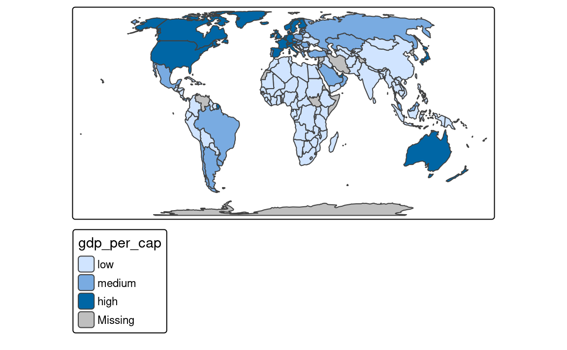
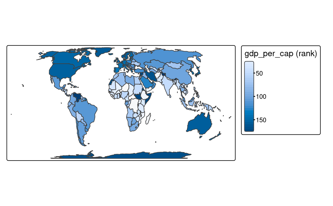
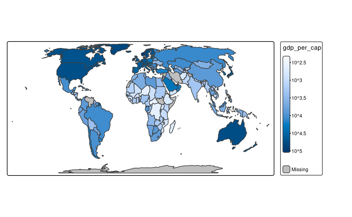
Continuous maps also represent continuous numerical variables, but without any discrete class intervals (Figure 8.3). A few continuous methods exist in tmap, including tm_scale_continuous(), tm_scale_rank(), and tm_scale_continuous_log10().
The tm_scale_continuous() function creates a smooth, linear gradient. In other words, the change in values is proportionally related to the change in colors. We can see that in Figure 8.3 (a), where the value change from 50 to 100 has a similar impact on the color scale as the value change from 100 to 150. The continuous scale is similar to the pretty style, where the values also change linearly. The main difference between them is that we can see differences between, for example, values of 110 and 140 in the former, while both values have exactly the same color in the later one. The continuous scale works well in situations where there is a large number of objects in vectors or a large number of cells in rasters, and where the values change continuously (do not have many outliers).
tm_shape(slo_regions) +
  tm_polygons(fill = "pop_dens",
              fill.scale = tm_scale_continuous())
However, when the presented variable is skewed or have some outliers, we can use either tm_scale_rank() or tm_scale_continuous_log10(). The tm_scale_rank() scale also uses a smooth gradient with a large number of colors, but the values on the legend do not change linearly (Figure 8.3 (b)). It is fairly analogous to the "quantile" style, with the values on a color scale that divides a dataset into several equal-sized groups.
tm_shape(slo_regions) +
  tm_polygons(fill = "pop_dens",
              fill.scale = tm_scale_rank())
Finally, the tm_scale_continuous_log10() scale is the continuous equivalent of the "log10_pretty" style of tm_scale_intervals() (Figure 8.3 (c)).
tm_shape(slo_regions) +
  tm_polygons(fill = "pop_dens",
              fill.scale = tm_scale_continuous_log10())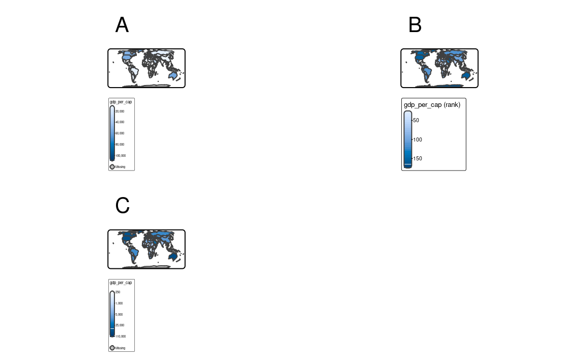
8.5 RGB scales
library(stars)
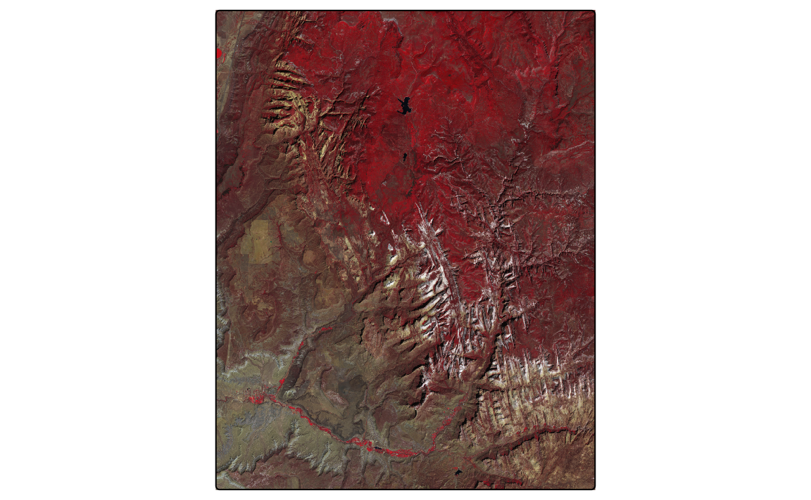
sat = read_stars("data/slovenia/slo_mosaic.tif")The sat object contains four bands of the Sentinel-2 image for Slovenia. The bands (blue, green, red, and near-infrared) are stored in the band dimension as B02, B03, B04, and B08. We can plot all of the bands independently or as a combination of three bands. This combination is known as a color composite image, and we can create such images with the tm_rgb() function (Figure 8.4).
Standard composite image (true color composite) uses the visible red, green, and blue bands to represent the data in natural colors. We can specify which band in sat relates to red (third band), green (second band), and blue (first band) color in tm_rgb().
True color images are straightforward to interpret and understand, but they make subtle differences in features challenging to recognize. However, nothing stops us from using the above tools to integrate different bands to create so called false color composites. Various band combinations emphasize some spatial characteristics, such as water, agriculture, etc., and allow us to visualize wavelengths that our eyes can not see. Figure 8.4 (b) shows a composite of near-infrared, red, and green bands, highlighting vegetation with a bright red color.

8.6 Bivariate scales
8.7 As-is scales
For more information visit the
?pretty()function documentation↩︎